Every time I see a wine marketing agency gush about how the future of winery websites is all about flashy animations, bold colors, and maximalist design trends, I can’t help but cringe. The internet isn’t a toy—it’s a tool, a tool that needs to work as hard as you do.
At 5forests, we’ve spent the past ten years working with wineries around the globe to bridge the gap between digital strategy and the wine consumer’s experience. Over that time, we’ve seen plenty of trends come and go, but the strongest ones—the ones that truly impact a winery’s success—are grounded in purpose and function.
So as 2024 draws to a close and everyone starts asking “what’s next for winery website design?” we’d say it’s all about neoclassical design. It’s a return to the classics—where form meets function and aesthetics meet purpose.
What is neoclassical design for the web?
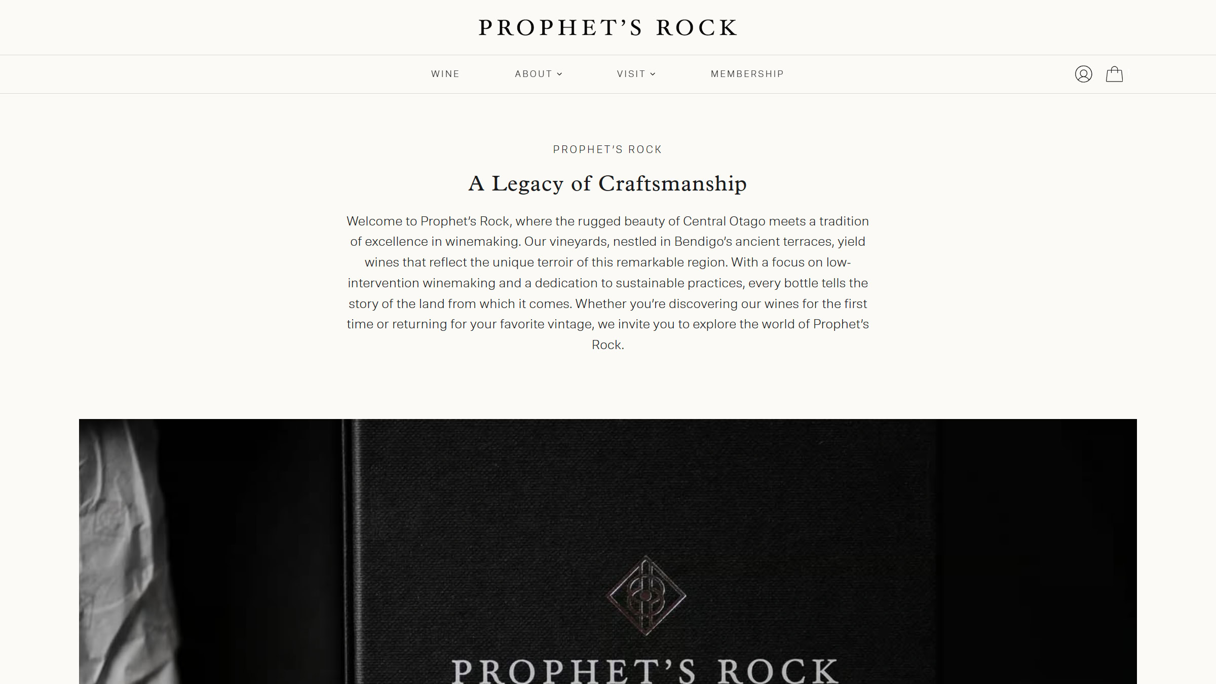
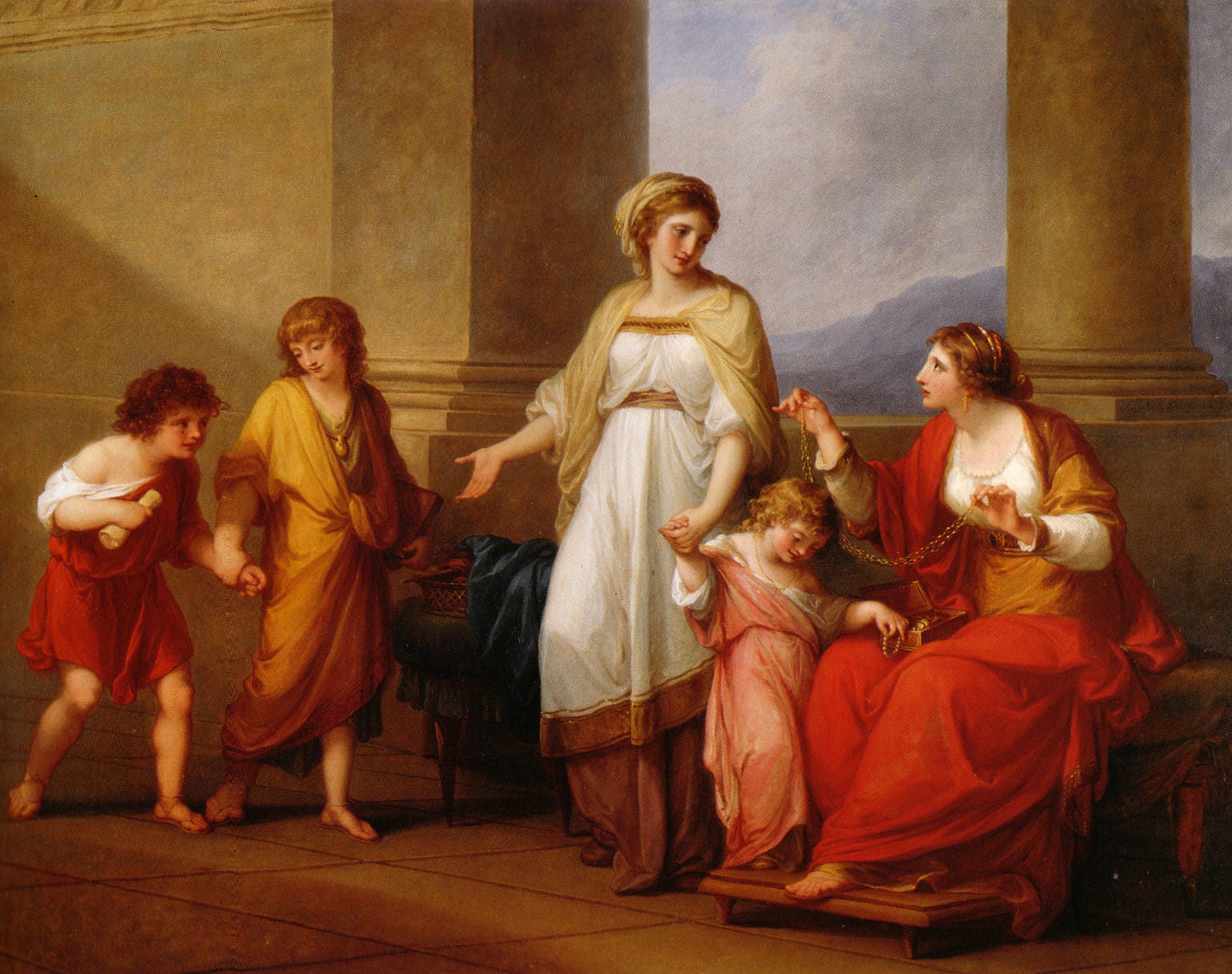
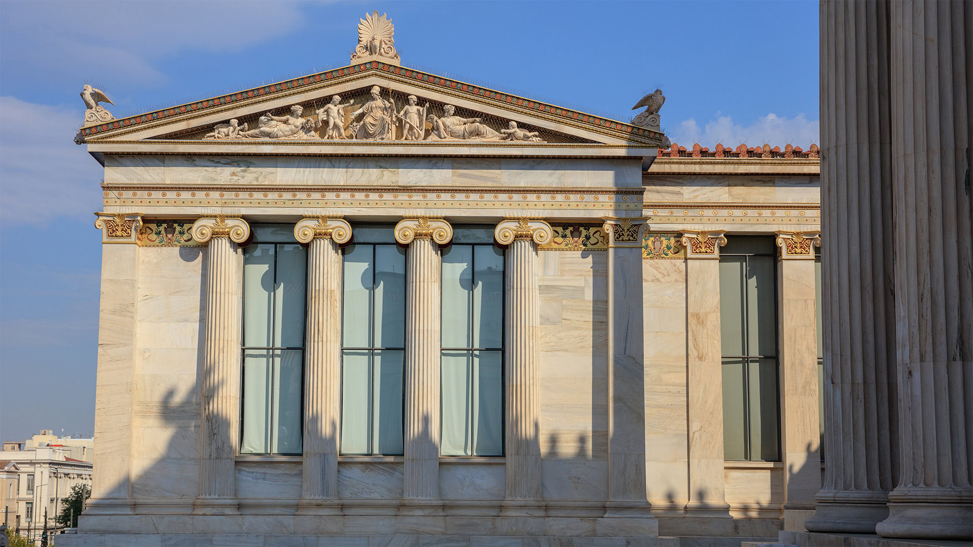
Neoclassicism in web design draws inspiration from classical architecture, emphasizing balance, symmetry, and timelessness. It prioritizes clean layouts, elegant typography, ample white space, and intentional color palettes to create user-friendly websites. Unlike minimalism, it balances simplicity with refined details, offering sophistication and purpose-driven functionality for an enduring online presence.
Key visual elements of neoclassical design include:
- Clean lines: A focus on simplicity that eliminates unnecessary frills.
- Ample white space: Allowing content to breathe and guiding the user’s attention to key elements.
- Clear typography: Fonts that are readable and elegant, working well for users of all ages across innumerable devices.
- Intentional color palettes: Soft tones or bold contrasts used sparingly to evoke emotion without overwhelming.
- Streamlined navigation: Simple, intuitive menus that make it easy for users to find what they’re looking for.
- Minimal distractions: A design that serves the content, not the other way around.
What is the difference between neoclassical and minimalist design?
Neoclassical and minimalist design share a foundation of simplicity, but they differ in purpose and execution. Minimalism design strips away all but the essential, favoring stark, functional layouts that often feel modern and utilitarian. In contrast, neoclassical design balances simplicity with elegance, drawing inspiration from classical architecture to create a sense of timeless sophistication. Where minimalism prioritizes absence—of detail, ornamentation, or embellishment—neoclassical design embraces intentional elements like symmetry, refined typography, and subtle textures that add depth without clutter. Think of minimalism as “less is more,” while neoclassicism says “less, but meaningful.”

Why neoclassical design is perfect for wineries
Neoclassical design shines a light on storytelling
Whether it’s the history of your vineyard, the craft behind your winemaking process, or the unique profile of each wine, your story sets you apart. Neoclassical design creates the space for these narratives to shine, combining elegant typography, clean layouts, and carefully curated visuals to guide visitors through your brand’s journey without distraction.
Neoclassical design showcases the offering
Neoclassical design emphasizes professional photography and clean, balanced layouts that let bottle shots and vineyard imagery take center stage. By focusing on the product and eliminating unnecessary elements, this approach creates an immersive experience where consumers can connect with your wine’s quality and story.
Neoclassical design improves user experience
A beautiful website is meaningless if it’s hard to use. Neoclassical design enhances usability by simplifying navigation and reducing friction. Visitors can easily find what they’re looking for—whether that’s booking a tasting, learning about your story, or purchasing wine.
Neoclassical design means faster load times
Speed matters, especially in ecommerce. Neoclassical-inspired websites are lightweight and rely on fewer graphical elements and code, resulting in faster load times. This is particularly important for mobile users, who demand quick, seamless access to their favorite brands.
Neoclassical design is naturally more mobile-friendly
With mobile browsing now dominating online activity, your winery site needs to work flawlessly across all devices. Neoclassical layouts translate beautifully to responsive designs, offering a clean and consistent experience for every visitor, whether they’re on a desktop, tablet, phone, or your grandmother’s Kindle Fire.
Neoclassical design boosts SEO
Google rewards websites that are fast, user-friendly, and accessible—qualities that neoclassical design inherently supports. Lightweight pages, clear content structures, and mobile optimization all contribute to better search engine rankings, helping wineries attract more visitors to your site.
Neoclassical design is timeless
Wineries trade on heritage, sophistication, and craft—values that align perfectly with a neoclassical aesthetic. Unlike trendy designs that risk feeling outdated in a few years, this style offers a timeless foundation that grows with your brand.

Accessibility and Neoclassical Design
Accessible web design ensures that everyone, regardless of ability, can navigate and interact with your website effectively. Neoclassical design inherently supports accessibility by focusing on simplicity, clarity, and intentional design choices that make websites easier to use for all visitors. Here’s why this approach works so well:
Clean layouts reduce cognitive overload
Neoclassical design avoids clutter, presenting content in a structured and predictable way. This benefits users with cognitive disabilities by simplifying navigation and making it easier to focus on key elements, such as menus, calls to action, or product details.
Emphasis on readable typography
Clear, elegant typography is a hallmark of neoclassical design. By prioritizing legible fonts with appropriate size and contrast, this style ensures that text is easy to read for visitors with visual impairments, including those with conditions like low vision or color blindness.
High contrast and visual hierarchy
Neoclassical design often employs a strong visual hierarchy and balanced use of contrast. This helps users distinguish between sections, buttons, and links, which is particularly important for those relying on assistive technologies or for users with limited vision.
Improved keyboard and screen reader compatibility
The structured nature of neoclassical layouts ensures elements are arranged logically, making it easier for screen readers to interpret and for users to navigate via keyboard controls. Clean code and simple design elements reduce the risk of accessibility barriers.
Inclusive design philosophy
At its core, neoclassical design values intentionality and purpose. This aligns with the principles of inclusive design, which aim to create websites that work for as many people as possible, regardless of physical, sensory, or cognitive abilities.

How to embrace neoclassical design for your winery website
Ready to bring this trend to your winery? Here’s how to get started:
Start by exploring your own site
Before diving into a redesign, take a moment to critically evaluate your current website. Approach it as if you were a first-time visitor. Ask yourself (or even better, your customers) these key questions:
- Does it feel cluttered? Are there too many competing elements on the screen, like banners, pop-ups, or overly busy layouts?
- Can you find what you want easily? Is it clear how to navigate to your wine shop, join your wine club, or book a tasting room visit? Or do you have to dig through multiple clicks or confusing menus?
- Does it rely too heavily on flashy animations? Are there distracting moving parts, hover effects, or autoplay videos that get in the way of enjoying the content?
- Is the navigation intuitive? Is the main menu hidden or overloaded with options that aren’t essential?
If your site feels more like a toy than a tool, it’s time to simplify. Neoclassical design focuses on cutting through the noise, so every element has a purpose. By removing excessive animations, flashy graphics, or distracting features, you can create a cleaner, more intentional experience for your users.
Invest in professional photography and typography
The heart of neoclassical design lies in its ability to elevate simplicity with intentional, high-quality visuals—and nothing achieves this better than professional photography and typography. These two elements are the backbone of a website that feels polished, sophisticated, and timeless.
Your wine, your vineyard, and your story deserve to be seen in their best light—literally. Ask yourself:
- Are your product images clear and consistent? High-quality bottle shots on clean backgrounds are essential for an e-commerce site. They should highlight details like labels, bottle shapes, and vintage markers.
- Do your photos tell a story? Do they support all your digital needs? If you need a little inspiration, we’ve created a downloadable shot list to get you started.
- Are your images cohesive? Professional photography ensures a unified look and feel, reinforcing your brand identity across all pages.
Typography in neoclassical design goes beyond mere readability; it sets the tone for your brand. Think of it as the digital equivalent of the perfect wine label—classic, inviting, and distinctive. Consider:
- Do your fonts reflect your brand personality? Choose fonts that align with your winery’s aesthetic. For example, a serif font can convey tradition and elegance, while a clean sans-serif font can add modern balance.
- Is your typography legible? Fancy fonts might look great in small doses, but readability is king—especially for body text. Stick with clear, well-sized typography that works on all devices.
- Are you using contrast effectively? Neoclassical design thrives on subtle contrast, so ensure your typography stands out against backgrounds without overwhelming the design.
Partner with experts who understand winery e-commerce
Your winery website needs to work as hard as you do. This is where partnering with experts in winery e-commerce makes all the difference. At 5forests, we combine deep industry experience and expertise with data-driven strategies to design websites that make a difference to your bottom line. Here’s how we can help:
- Tailored solutions for your winery: Every winery has a unique story and audience. We craft designs that highlight your brand while meeting your business objectives.
- A focus on functionality: Beyond aesthetics, we build websites that are fast, user-friendly, and optimized for sales. From intuitive navigation to streamlined checkout experiences, we design with your customers in mind.
- Data-backed decisions: Our approach isn’t guesswork. We analyze your current site, customer behavior, and market trends to create a website that doesn’t just look good—it works better.
The result? A website that combines timeless design with modern functionality. One that captures the personality of your brand while driving conversions, increasing sales, and creating a lasting impression on your customers.
Ready to rethink your winery website design?
Let’s bring timeless elegance and modern functionality to your e-commerce store.
